Developers Blog 3
Dev Blog 3 – The Castle
The Castle in Total War Battles: KINGDOM plays a central role. Not only is it the centre of your town, your flag hoisted on its tallest towers, your banners gracing its walls for all the land to see - its size also determines how large your town can grow, you collect your tribute there and train your peasants to become workers. In short it’s the heart of your realm.
Quite fittingly then, it dominates the architecture and style of your town and really sets the mood for your realm and as such we think it deserves a special place in our dev blog, so today is all about the castle, how it came to be and why it looks the why it does.
The right castle
Possibly one of the first things players notice is that the castle in KINGDOM has a classic look and feel to it. What they might not realise is, that the reason for this was a deliberate and even slightly unorthodox one. Castles in 10th century England were often a fairly simple affair and still quite far from the classic estates we all know from books and films set in medieval times.
These structures are known as motte-and-bailey castles. They consisted of a keep, more often than not made of wood rather than stone, which sits atop a manmade mount called motte. It’s accompanied by an enclosed courtyard that is protected by a ditch and palisades.
While this setup provides good defensive capabilities, unfortunately it doesn’t make for the most exciting view and thus became a bit of a dilemma for our artists in the early stages of development. Being absolutely faithful to this very exciting and turbulent time period would have meant to sacrifice the look and feel of the game. A small wooden moot-and-bailey surrounded by a few wooden huts and longhouses just looked a bit dull and lifeless.
So we looked for inspiration in the iconic architecture of later centuries – mighty stone castles of the High Middle Ages and found a rather neat example in our own backyard – Bodiam Castle in East Sussex.
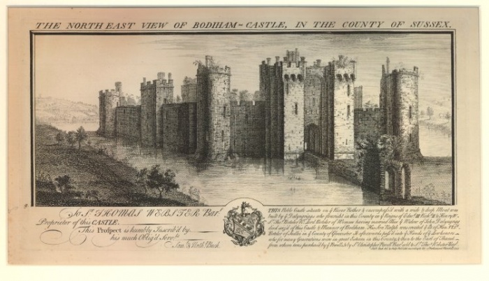
As you can see by this wonderful engraving from the 18th century, Bodiam Castle is a lot closer to the archetypal medieval castle we were looking for. With its imposing, solid stone walls and tall towers it had the scale and character we wanted to show in the game. While it wasn’t completely historically accurate, it offered a blue print for an authentic art style rooted in reality rather than something from the realms of fairies and dragons.
From Castle to Town
The most important piece of the puzzle was creating a compelling and engaging world, which players would like to return to and call their own. This ethos of course didn’t only apply to the castle, but all the buildings in the game. The castles design went through quite a few iterations and every time it changed, the surrounding town changed with it.
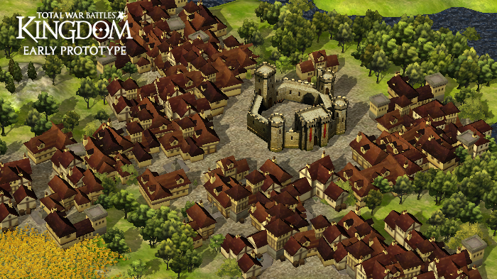
In this early prototype you can see the influence of Bodiam castle pretty well. Its high and broad walls make it clearly stand out. You can already see the hex-grid that underlies the realm map influencing the shape of the castle itself. The townhouses however feel a bit crammed in and at the same time too detached from the keep itself.
The goal here was to make the town look organically grown, with the all the little houses fitting into each other, making the town look full and vibrant. You can see plenty of crooked alleys and overhanging jutties, reminiscent of in medieval town centres that you can still find today.
From a gameplay perspective this meant however that nothing really stood out. Bearing in mind that the game was intended to run on mobile devices this was a serious problem, as soon as more functional buildings came into play.
Imagine you’re sitting on a bus and play the game on your phone, reflections run across the screen and the lighting is bad – ideally this shouldn’t have an impact on your gameplay, but it’s a different story if you can’t identify the elements on screen easily.
Since gameplay should always come first it wasn’t too surprising that the hex-grid of the map pointed the art design into the right direction.
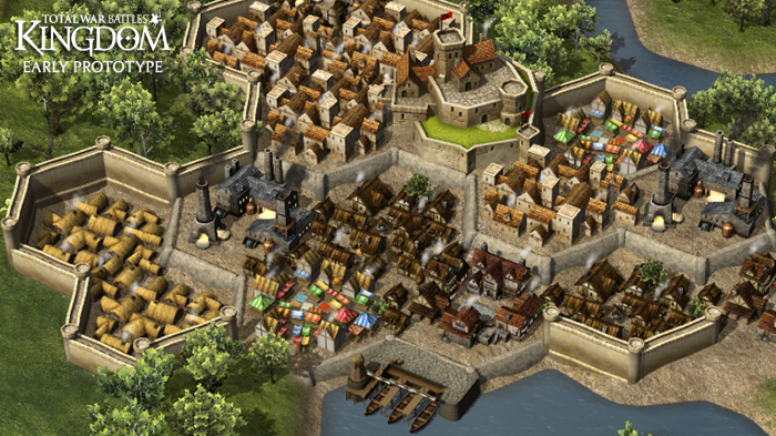
This later version looks much more like the game now. There’s more verticality on the board and the Castle really stands out, towering over the surrounding settlement, making it its own. It no longer seems detached and fits right into the picture.
Moving away from a hyper-realistic to a more stylised approach the houses still give you a feel of a town bursting at the seams with life, but thanks to the hexagonal tiles and the more vibrant colours it’s much easier to distinguish the individual building types.
The picture is also an example of art influencing gameplay. The Art team was very keen about the stone walls, as they give the town more coherence and a medieval atmosphere. The Design team took this on board and the walls help you keep your city safe from floods and invading armies.
From concept to the final design
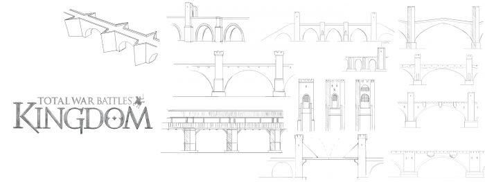
While the design team was busily tinkering on gameplay elements and programming, the art team went through several iterations of the overall design. For some elements the artists started with concept drawings like these bridges.
With most of the other buildings and elements however, they started from scratch in-engine. The final version of the castle is full of minute detail. It looks rather imposing, filling out every last inch of the hex-field it’s occupying and is clad in the colours of the realm, that make every player’s realm unique.
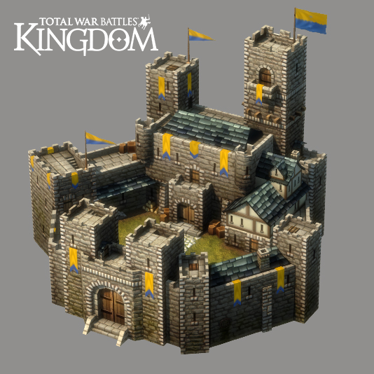
The slate roofs, sturdy oak doors and bulky stone walls, even the flags of the realm, set the theme for other military buildings, like the garrison, stables and the church. A particular challenge was to working within the restrictions of the hex field, yet leaving enough room for upgrades and making each tile fit in organically.
This limited space means that the devil really is in the detail. A chimney more here, a few more targets there, sometimes an attachment or even a change from a church into a cathedral.
So when you boot up the game next, see if you can spot all the little differences! We’ll leave you with few more building models taken from the game.
Until next time,
Keep it regal!
